How Anita Ashiru Built the Visual World of “Call of My Life”
Inside the production design process behind one of Nollywood’s most visually appealing romantic films, "Call of My Life", written by the film's Production Designer, Anita Ashiru. The post How Anita Ashiru Built the Visual World of “Call of My Life” appeared first on BellaNaija - Showcasing Africa to the world. Read today!.

Courtesy: Anita Ashiru
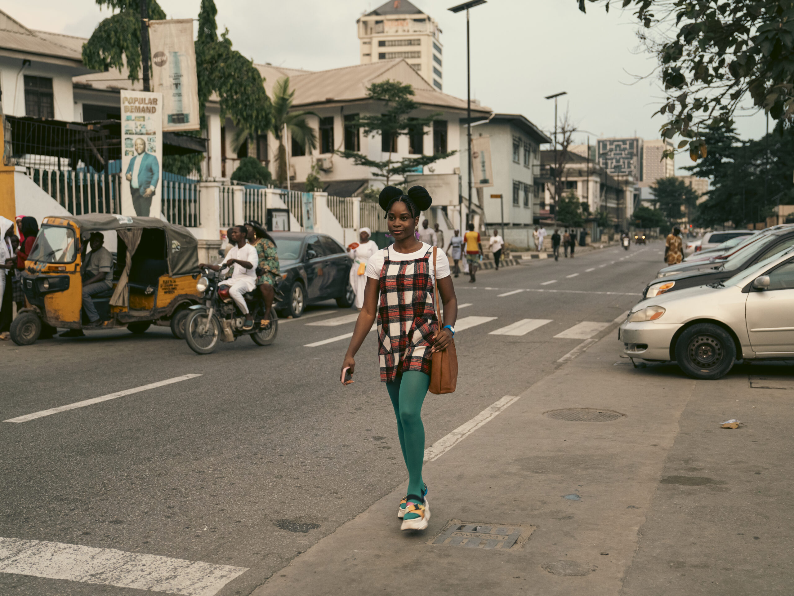
One of my favourite reactions to Call Of My Life has been people saying things like “I didn’t know Lagos could look like this,” because honestly, that was the entire point. Lagos is usually portrayed through intensity, chaos, hustle, traffic and survival. Even in romance films, the city often feels emotionally hard; something the characters are trying to escape rather than exist within.
But while building the visual world of Call Of My Life, I became obsessed with the idea of what it would look like to romanticise Lagos realistically, without pretending the city is perfect or as a fake city, but by looking at it through a different lens of softness and ease. I wanted Lagos to feel emotionally alive, and that became the foundation of the production design process.
While designing the film, I kept returning to films that make cities feel personal, like Rye Lane, Me Before You, In the Mood for Love, and even older British romantic comedies that understood how environments could support emotion. In Rye Lane, South London feels vibrant, youthful, playful, and emotionally expressive. The colours are bold, and you could feel and see the texture of the city through the film’s intentional styling, yet every frame feels soft without losing the authenticity of the city. With Me Before You, the world feels warm and emotionally safe. The production design leans heavily into softness, nostalgia, and intimacy.
With Call Of My Life, I wanted Lagos to feel like a version of Lagos where tenderness could exist, and not the version of Lagos people are scared to fall in love with. A city where someone could miss their train because they were staring at someone they loved. A city where someone could fall in love with someone just by the sound of their voice.
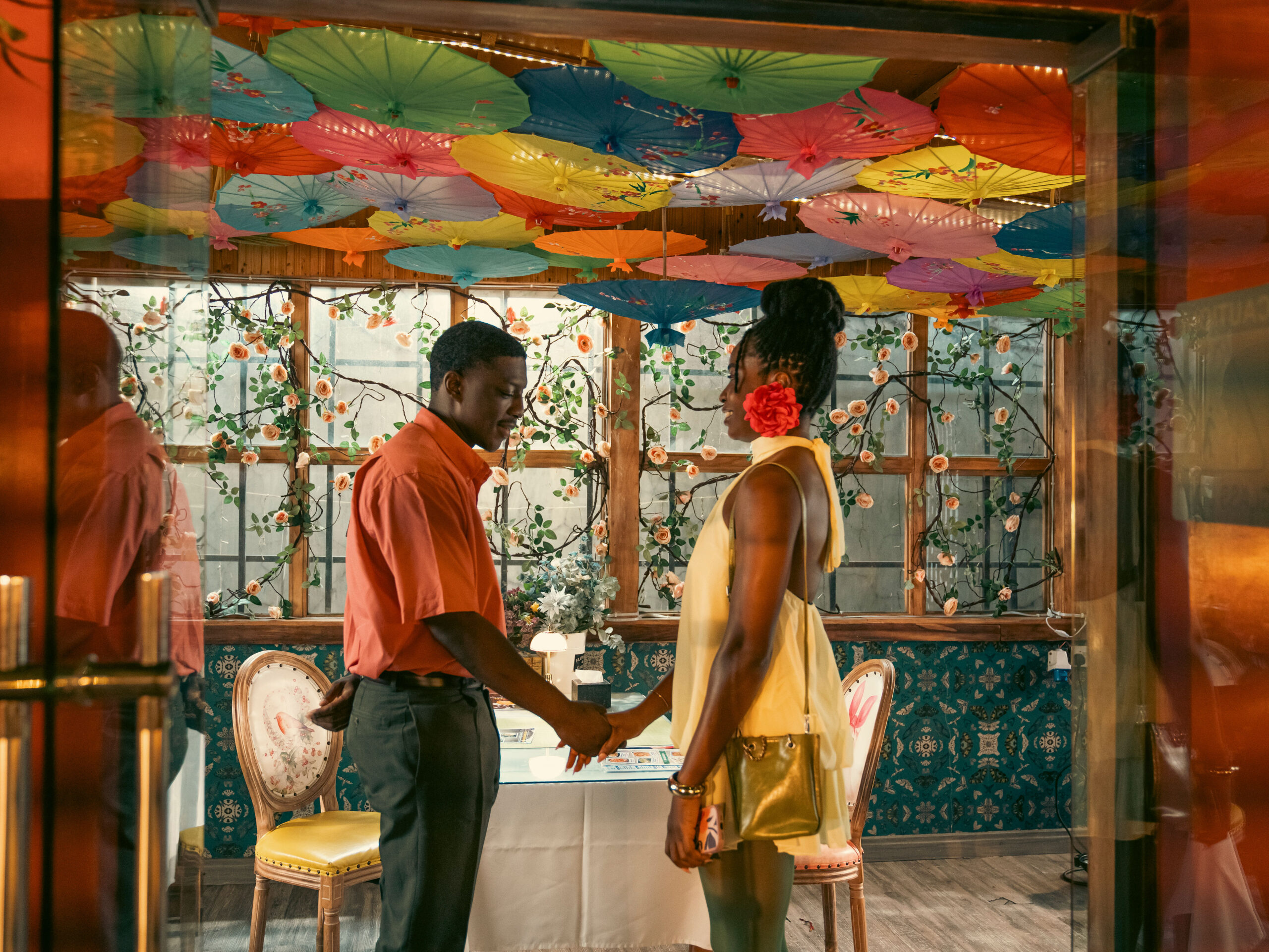
To achieve this, colour theory became the heart of the visual language of Call of My Life. Very early in the design process, I knew I wanted the film to feel emotionally warm and dreamy, but at the same time, I didn’t want it to feel artificial or overly stylised. The goal was never to create a fantasy detached from reality. It was to amplify the emotional beauty that already exists within everyday Lagos, but is often shadowed by the chaos.
I built the film’s palette around soft pastels, retro tones and emotionally warm colours. Even when brighter colours appear, they are carefully controlled within the frame so the image always feels cohesive rather than visually overwhelming. What made this process especially interesting was that Lagos already naturally carries warmth within its environment, so instead of stripping those qualities away, I leaned into them and heightened them through our design choices.
We amplified environments to fit within the film’s colour world while still preserving authenticity. So, even at its most stylised, the world still feels believable and lived-in.
Costuming as Emotional Storytelling
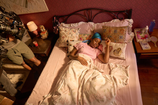
One thing I cared deeply about was making every character feel visually distinct before they speak, and this is evident from the first scene. Soluchi’s styling, for example, is intentionally whimsical, instinctive, playful and slightly unconventional. Her outfits often feature softer colours, expressive layering, unexpected accessories, textured fabrics, playful colour combinations, and pieces that feel chosen rather than perfectly styled. We wanted her to be someone who dresses in what she feels; even her earrings became part of storytelling.
Courtesy: Anita Ashiru
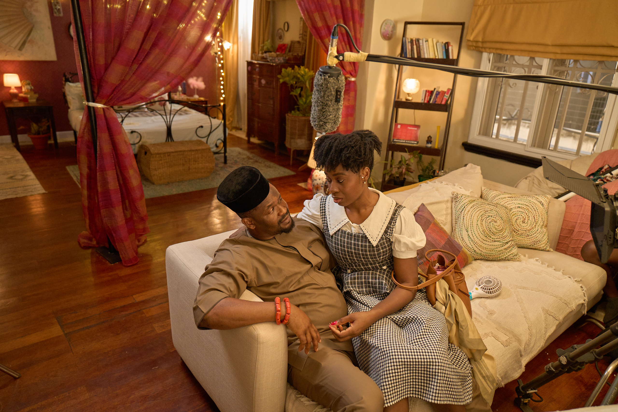
Kalu exists in complete contrast. His wardrobe remains more practical, repetitive, and structured. Safer tones. Traditional silhouettes. Cleaner styling. Emotionally controlled choices. By simply placing Soluchi and Kalu side by side visually, you could already feel their incompatibility before dialogue even confirmed it.
Then there’s Eli, with whom, visually, things soften again. His styling feels more emotionally expansive and relaxed. His world visually accommodates Soluchi rather. Their colour palettes begin to complement each other naturally, and, subconsciously, the audience feels an emotional ease around them. Something production design and costuming can powerfully do is make audiences feel relationships before characters even define them.
Courtesy: Anita Ashiru
Lagos as a Character
Courtesy: Anita Ashiru
One of the most important creative decisions we made was to treat Lagos as a living emotional presence within the film—not just a location, but a character. We wanted the city to feel intimate rather than overwhelming, romantic instead of aggressive, and textured instead of the usual chaos. This meant paying attention to every detail: architecture, practical lighting, restaurant interiors, street textures, wall colours, reflections, fabrics, environmental tones, and even how night scenes appeared. Many romantic films set in cities like London, Seoul, Paris, or New York understand that cities can embody emotional personalities.
In the design process, I aimed to give Lagos that same cinematic tenderness. I believe we achieved it.
The post How Anita Ashiru Built the Visual World of “Call of My Life” appeared first on BellaNaija - Showcasing Africa to the world. Read today!.